Introduction.
One of the main frustrations of any online shopper is the inability to interact directly with products and sales assistants. With less information about the desired item, customers are less likely to make a purchase decision due to high uncertainty.
Is it going to fit right? Is it the right size? What’s the colour going to be IRL? We have all been there – no matter the type of purchase, from furniture to beauty products! That is why it is crucial for any e-commerce website to show the product in action and minimise the information gap and, as a result, increase the store’s conversion rate.
In this blog post, we delve into 5 great examples of successful product pages and how they entice shoppers to purchase products online.
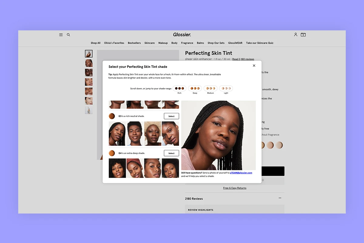
Glossier are a skincare and beauty brand which was one of the first that popularised DTC marketing in this very tangible industry. They use a unique functionality that allows users to ‘Find Your Shade’ of the foundation and concealer. Essentially, customers can select their skin tint shade based on real-life examples.
By showcasing their product in action, Glossier are decreasing the risk to potential customers, pushing them towards a successful conversion. Additionally, their customer service team can also advise on the right product shade, and they’re known for a great refund policy for unsatisfied customers.
Why it’s great?
- Useful ‘Find Your Shade’ feature, as well as dynamic photography depending on the shade selected by the user
- Seeing beauty products on people with different complexions reduces the uncertainty
- Product videos to see the application in action
- Customer review highlights increasing trust, an option to filter reviews by skin type and tone, as well as age and keywords
- ‘Save with sets’ featured on the product page, as well as cleverly built into the checkout to upsell
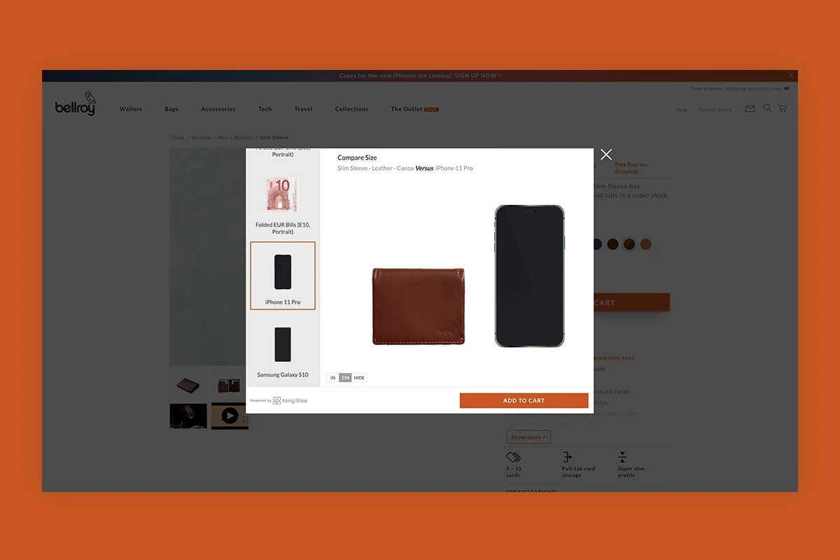
Bellroy helps customers better envision their products by using a size comparison tool powered by Tangiblee. The tool lets you compare their wallets side by side with everyday items, such as phones, notes and cards. By comparing wallets to other items you’d likely find in your pocket, this tool allows customers to picture what would best suit their size requirements and preference.
Why it’s great?
- Clear representation of the product size – wallet versus euro/USD/GBP note etc
- Product highlights for quick information
- Product video to see it in action
- Warranty information featured prominently to build trust and reassure customers about the product quality
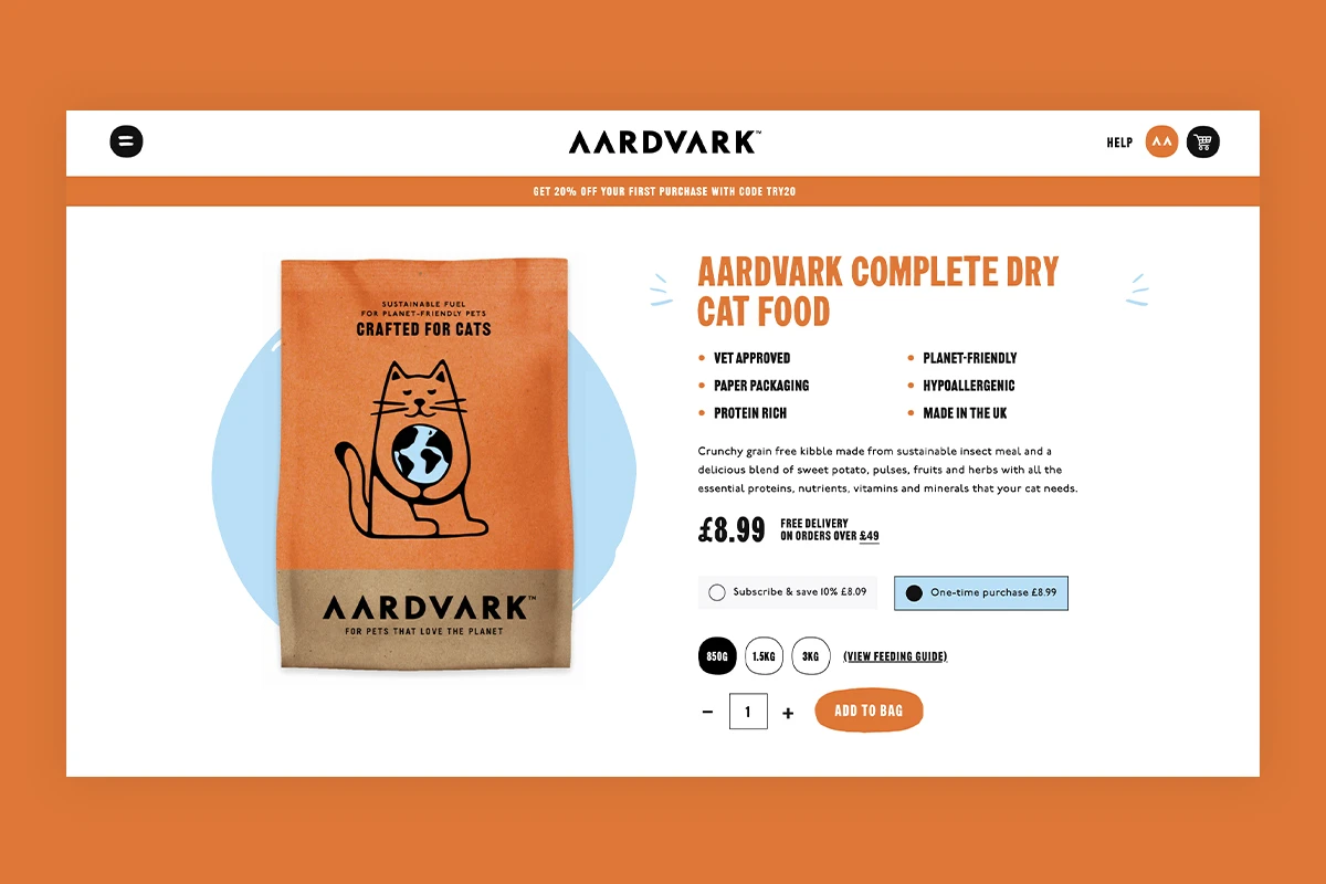
Aardvark, who make sustainable pet food for cats and dogs, are all about educating visitors with informative content on their products. With this in mind, Aardvark’s product pages are built around product transparency and their sustainable ingredients. An important part of any website selling consumer goods is to disclose relevant information, such as ingredients and safety, for consumers to understand before making a purchase.
Why it’s great?
- Insect-based pet food is still unknown to many customers, who are unsure about the health impacts and feeding
- Aardvark’s product pages provide quick facts, a transparent ingredients list, and links to more information on the science behind insect-based kibble
- Users can conveniently subscribe to selected product sizes according to their needs, straight from the product page (saving 10% on each order)
- Easy subscription journey not only increases the convenience to users but also gives the business more stability in forecasting sales
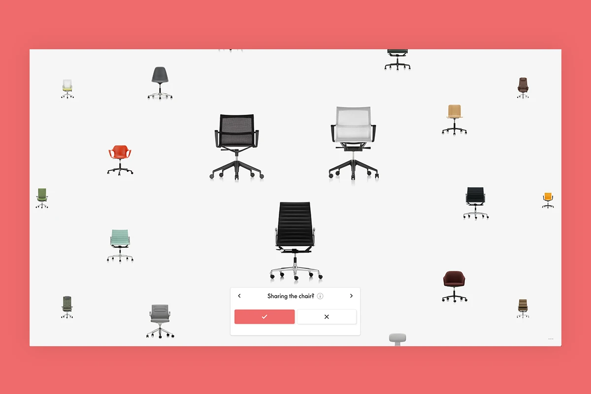
Vitra, a renowned Swiss designer furniture company, use an online questionnaire to bring their in-store experience online. It asks questions about sitting position, time spent sitting and users’ height to narrow down the best chair for a customer – as if you were in the store, speaking to an expert yourself. Automating this journey helps their customer service team to decrease the number of enquiries about products.
Why it’s great?
- Quizzes are a great way to engage users and make the experience more fun
- It frees up the customer service team’s resources, allowing them to reply to customers faster
- Upon completion, Vitra show an easy-to-browse catalogue of suggested products sorted by match %
- A useful mobile AR visualisation tool provided by Emersya allows users to see the chair in their own room
- Considerate user journey for desktop users – providing a QR code to the mobile AR tool
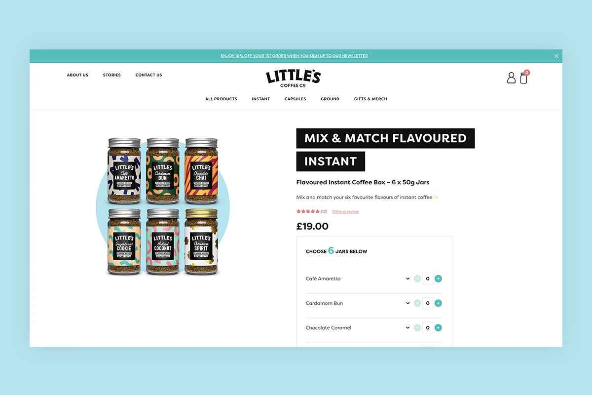
Little’s are a premium flavoured instant coffee company, available in most grocery store chains as well as DTC on their website. They offer many interesting flavours, and their customers love experimenting with new tastes. By offering a flexible ‘mix & match’ functionality, users can pick the most appealing flavours as a bundle and save a few pounds. A drop-down element allows potential customers to easily see product descriptions and ingredients before adding the flavours to the bundle.
Why it’s great?
- Mix & match functionality gives users the freedom to experiment with new flavours
- The product page features all relevant product information to make an informed purchase (flavour descriptions and ingredients)
- Seamless user journey, compared to adding 6 products individually (and allows the user to save a few £)
- Prominent product fact icons
- Featuring product reviews increases the credibility
